At Oracle NetSuite I had the opportunity to work on a product that is one of the most impactful and valuable to our users - the dashboard. The dashboard is the first page users land on That is the one place and Where They can see a complete overview of Their business activity.
The Problem
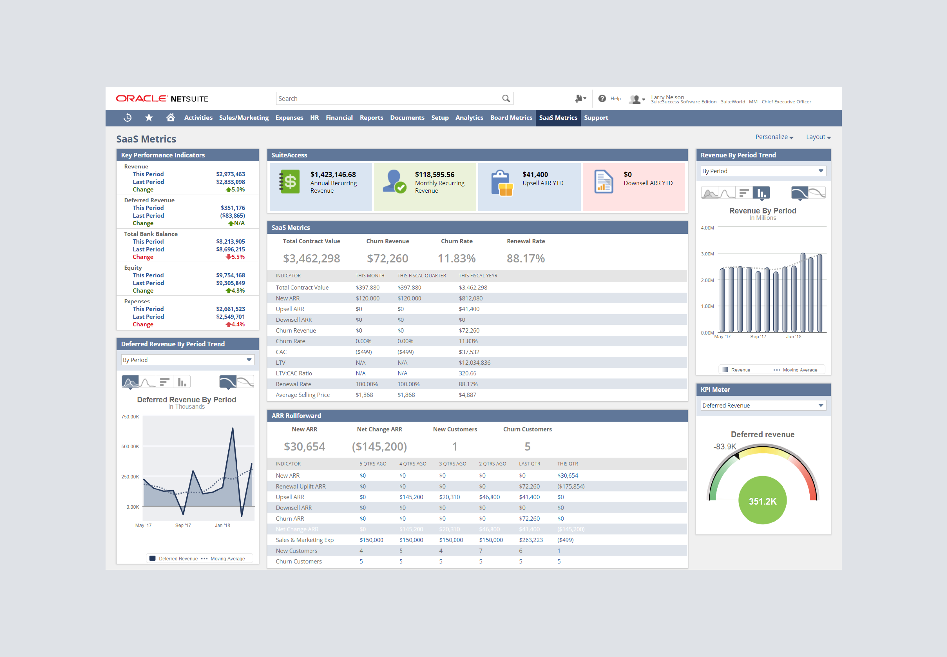
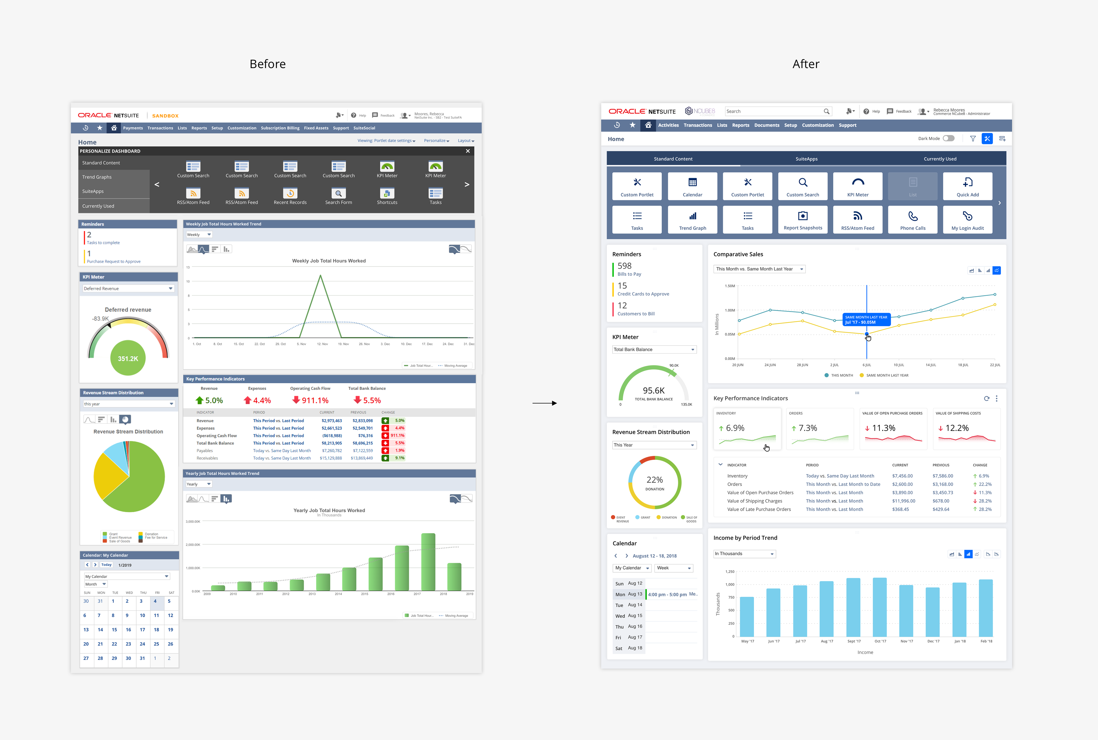
The current Oracle NetSuite dashboard is a complex tool that can quickly become confusing and intimidating for users. The goal of our dashboard is to give users a clear understanding of their business data but unfortunately, due to an outdated UI and an overly complicated experience, our users were dissatisfied and frustrated. Below is a screenshot of the original Oracle NetSuite dashboard.
Understanding users and their frustration through research
I wanted to hear from as many users as possible in order to fully understand their pain points. I reached out to our UX research team and we sent a survey to customers from a varied range of industries and countries. The survey allowed us to ask direct questions with quick response times. I wanted to learn a few key things from our users such as: why are they using the dashboard? Are they satisfied with the experience or dissatisfied and why?
I evaluated the results of the survey and learned that almost 80% of our customers were dissatisfied and wouldn't recommend the dashboard to others. I dug deeper and noticed that there were 2 popular pain points - An unpredictable experience and an outdated, confusing UI.
Improving Consistency & Refreshing the UI
I wanted to identify our UI inconsistencies in order to better understand how we could improve them. After a full evaluation of the dashboard, countless conversations with product managers, engineers and designers, I understood the extent of the problem - we had 8 different types of buttons that performed the same action, 3 types of tabs, 2 context menus etc. The list went on and on.
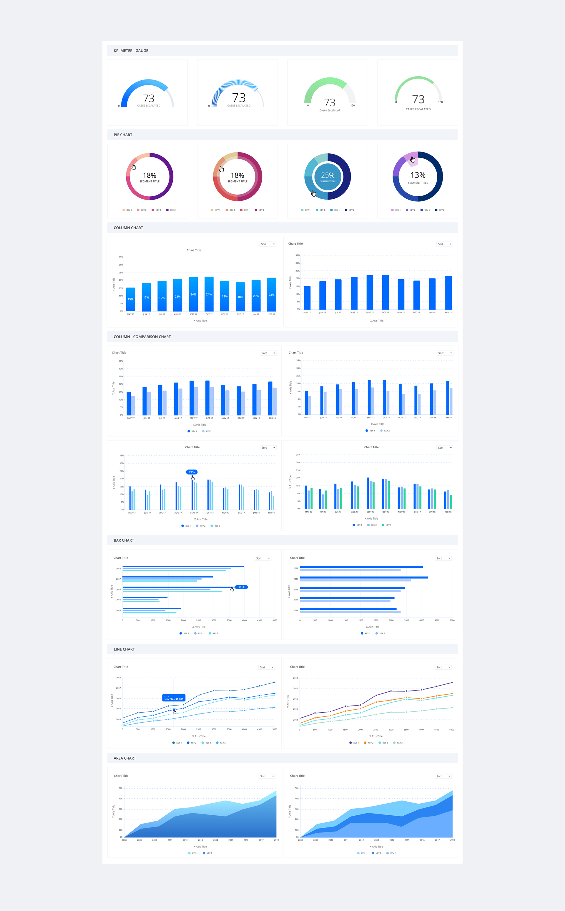
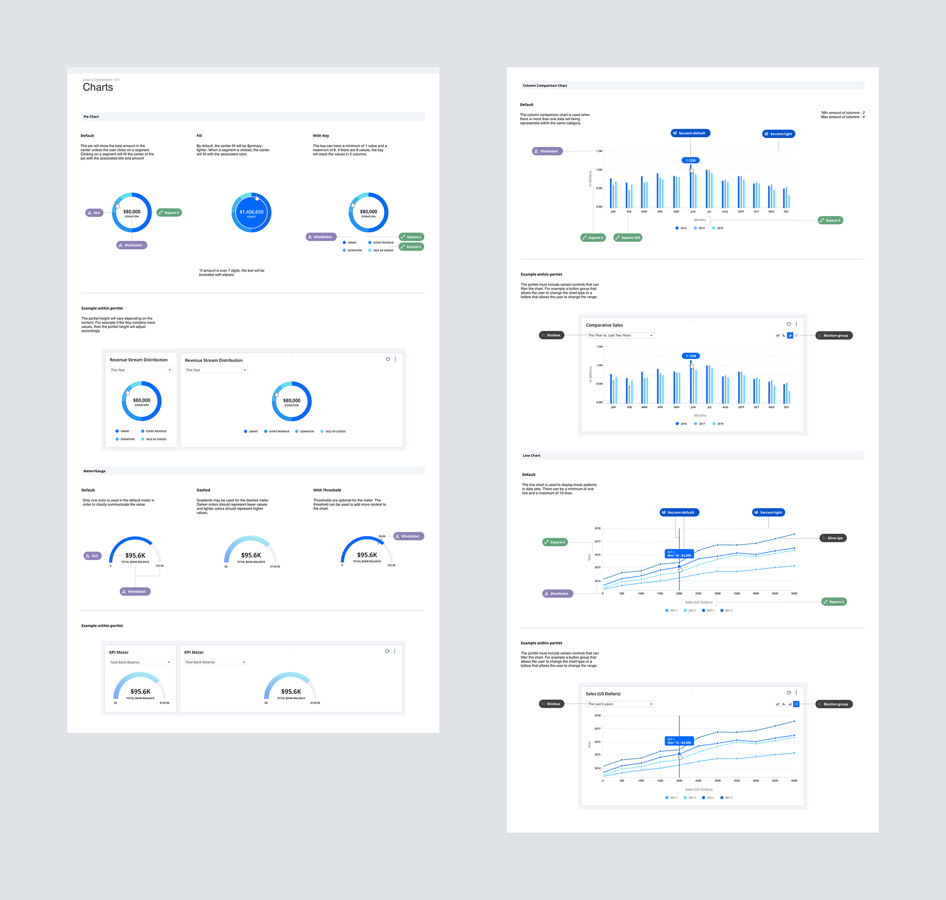
I replaced the UI with consistent components, inherited from our design language, as well as creating a few custom components specifically for the dashboard, such as portlets and charts. Below is an example of some of my chart exploration:
Testing with Customers
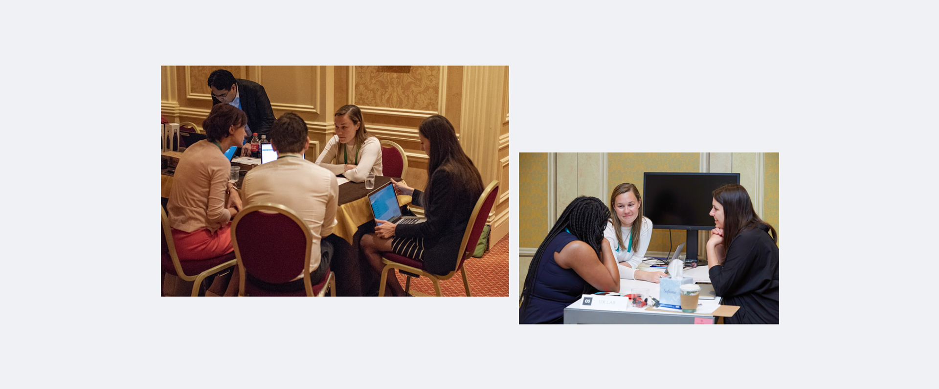
After testing my designs internally, I tested my final concepts with users in person so that I could thoroughly understand their thoughts and feelings. I met with 10 different customers and tested 3 different prototypes with them. I asked them to complete certain tasks with each prototype so that I could understand which design they found the easiest, quickest, most enjoyable to use and why.
Testing Outcome and Learnings
I gathered the results of the test using a survey. I asked customers to input their preferred prototype for each task and to explain why. My biggest take away was 'the more minimal, the better'. Customers instantly preferred the most minimal option where I had made the data the key focus. I learnt that they could notice patterns in the data much quicker when color was used sparingly - only for charts and for highlighting key metrics.
Ensuring Consistency in the Future
The dashboard is an ongoing project and we will continue to iterate and improve it for our customers with each release. Our team was growing quickly and we were introducing new designers to the project so I needed to find a way to ensure that we would continue to provide a consistent experience in the future.
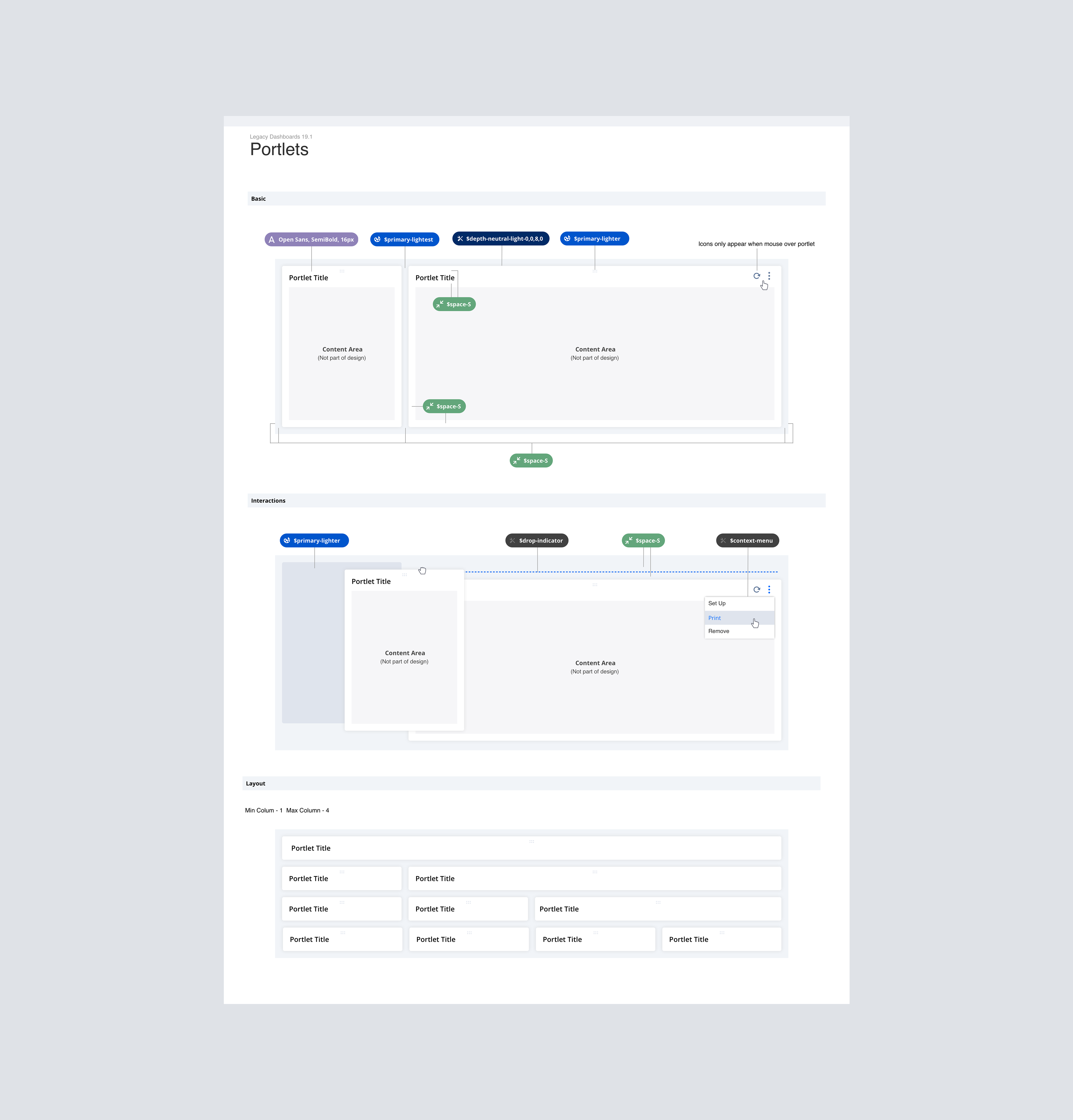
I created a style guide for each component and chart which could be referred to by designers and engineers. I also created design tokens for the engineers to help them build the designs quicker and more efficiently.
Measuring the Outcome
Once the redesigned dashboard had been released, I sent another survey to customers to see if their opinions had changed. We saw a noticeable increase in user satisfaction. Customers opinions had significantly improved. 75% of customers now said that they would recommend the Oracle NetSuite dashboard, compared to 23% before the redesign.
The dashboard is a large feature of our overall product and there is a lot more that we can and will improve in the future, however this was a promising first step towards a more usable and enjoyable experience for our users.