Role: Art Director
Responsibility: Facilitate and manage a company-wide rebrand and roll out to product
Project Timeline: 6-8 months
Depop is an online marketplace where the new generation of digital natives, young entrepreneurs and style icons come to not just buy and sell, but explore and influence.
The Problem
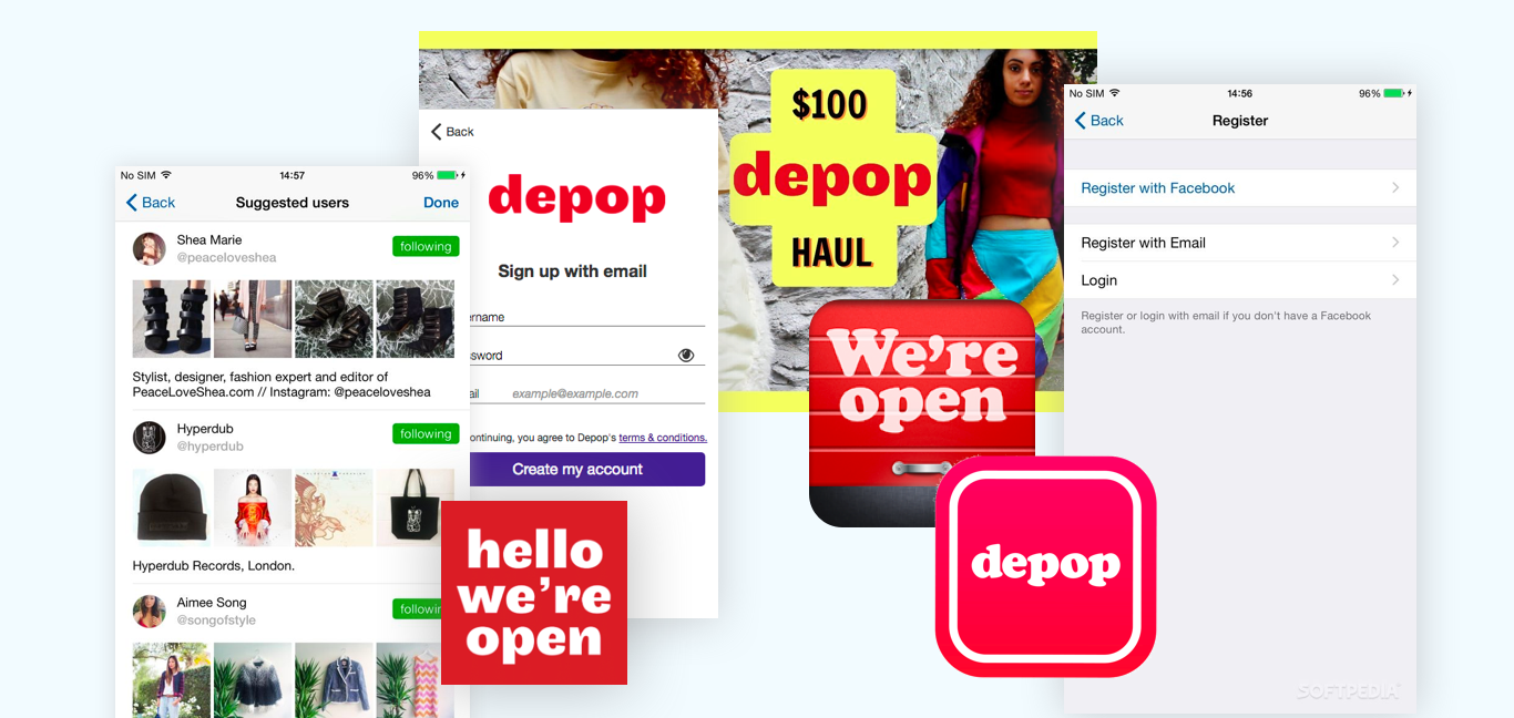
Users did not understand the value of Depop. We witnessed a lack of brand affinity amongst our users which decreased our rate of user adoption and returning users. Below is a snapshot of the Depop brand before this project:
The Solution
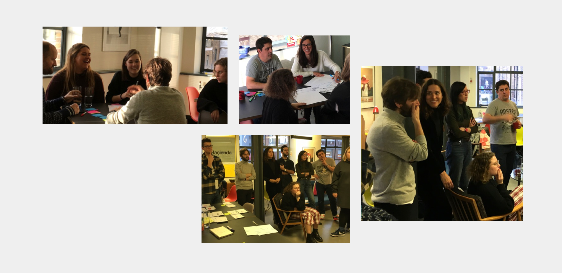
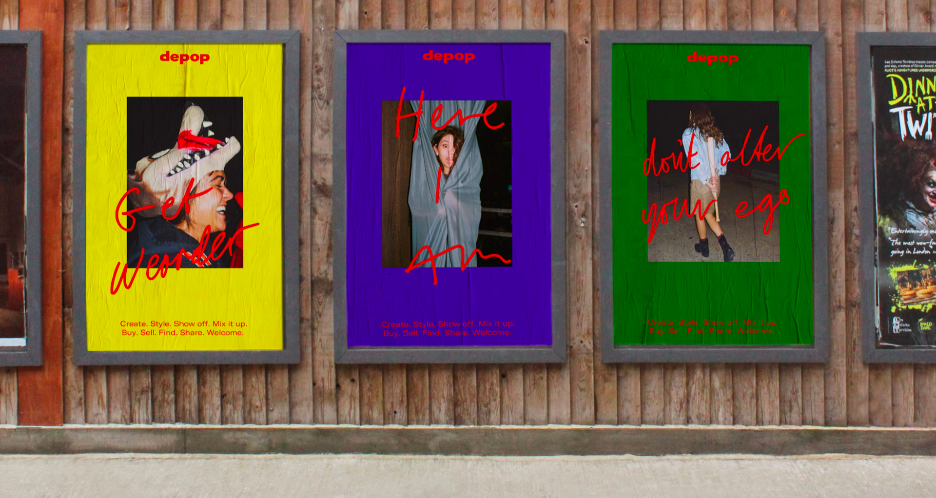
Working closely with DesignStudio we defined a new brand proposition to inspire our internal team. Giving them the platform, voice and opinion to harness what made Depop, Depop. After numerous workshops with our team, we captured the spirit of 'leading the way' and 'unfollowing expectations'.
It was clear to us that we were not just redesigning our brand elements, we were defining a cultural movement for a hyper-creative generation.
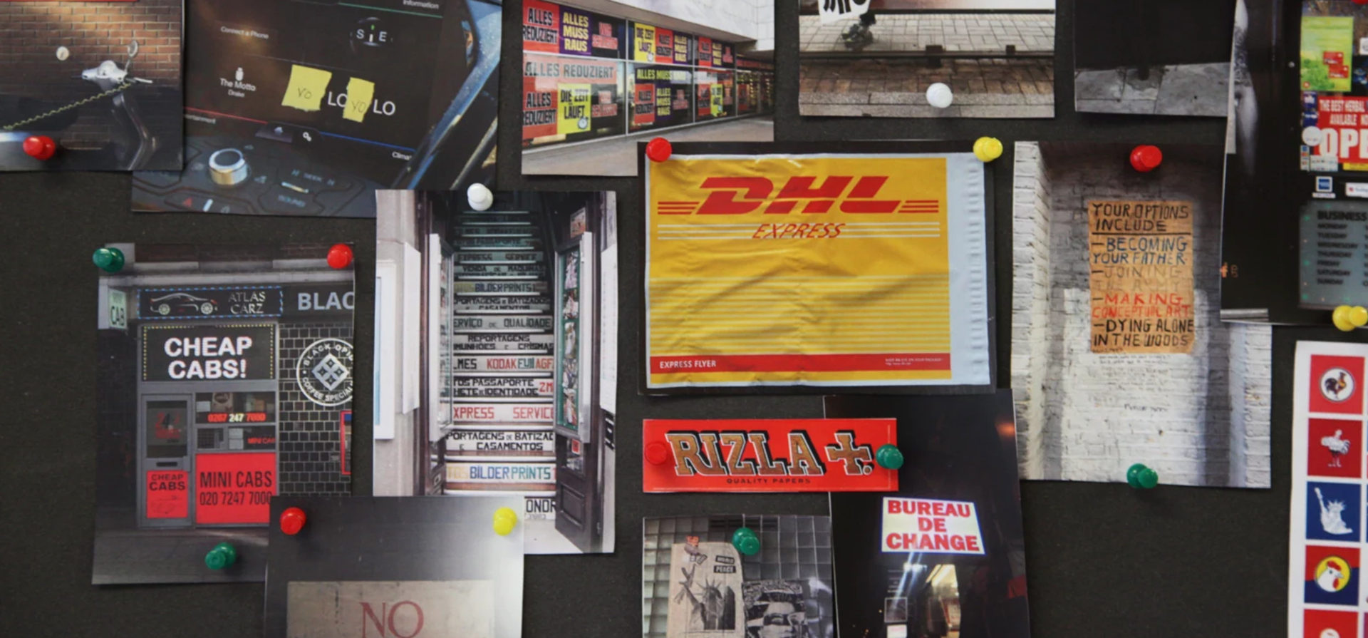

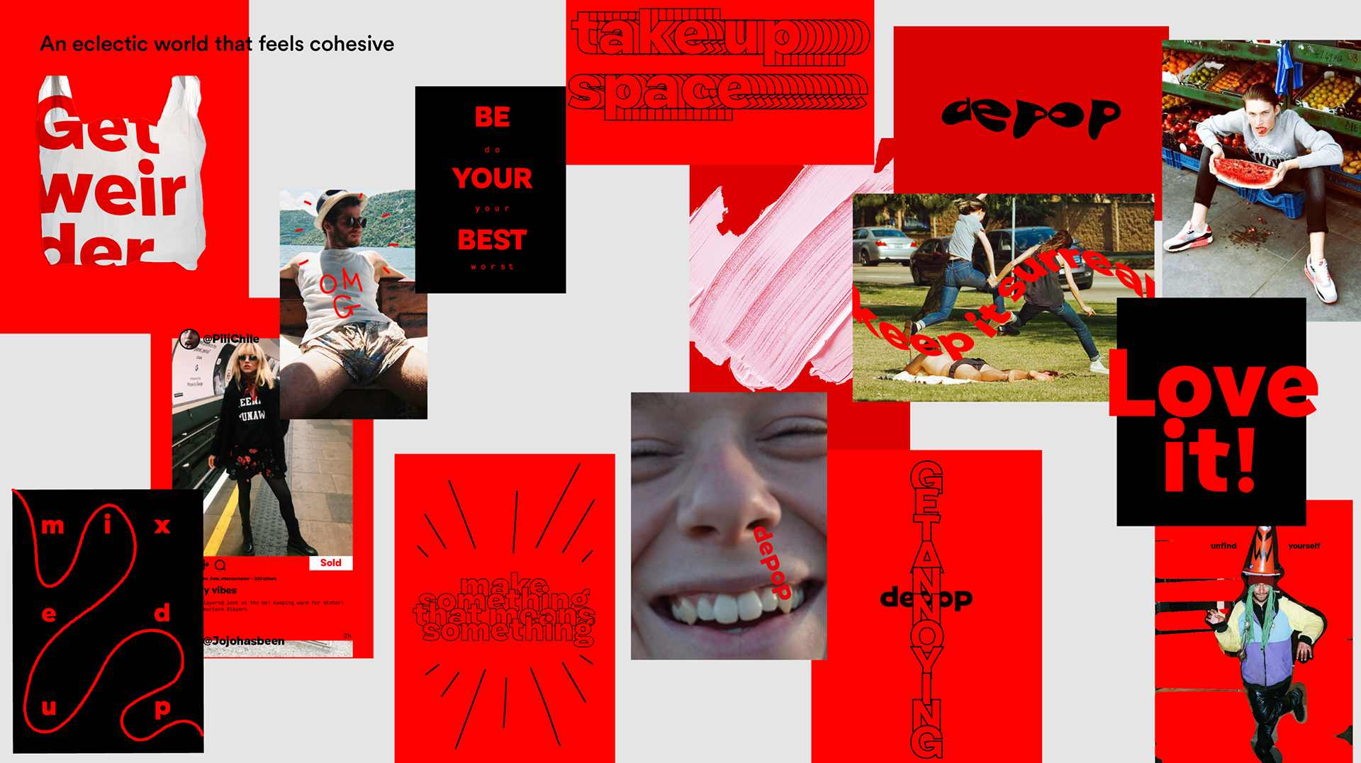
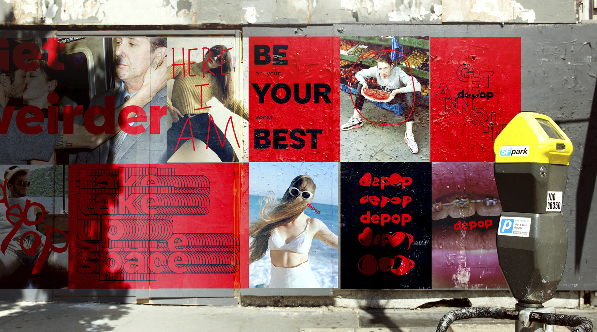
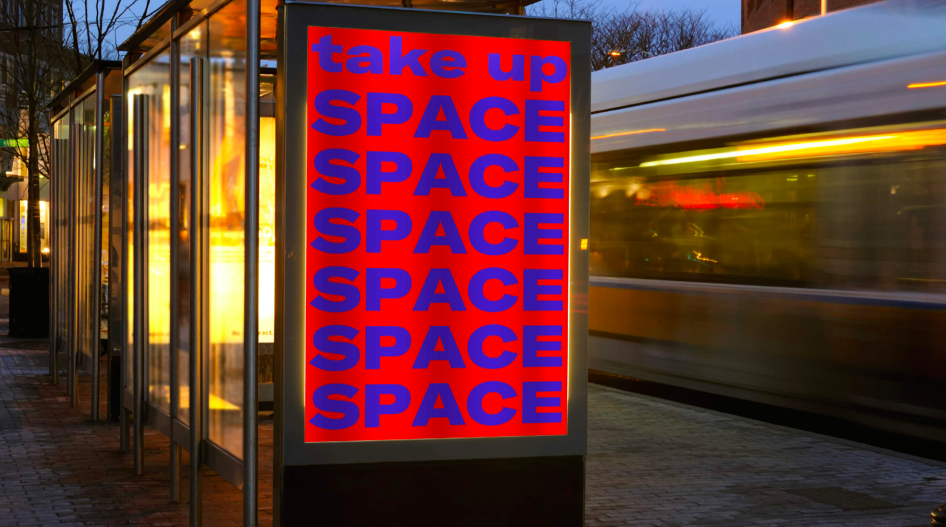
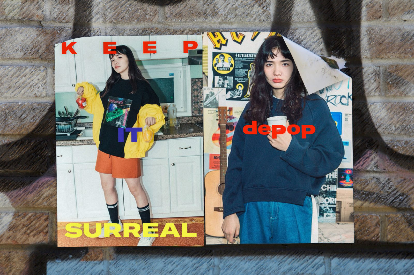
Our visual research brought us to an anti-design aesthetic. We created a bold, brash and vibrant colour palette with a loose layout. The typeface, GT America, is unmistakable, with the ability to stretch for any piece of communication.
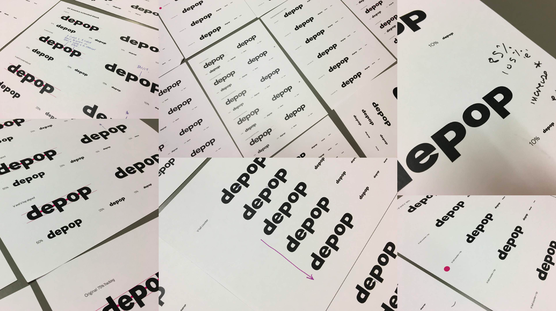
We designed a logotype that embodies the playful spirit of the brand – it’s bold but not too serious.


The Outcome
To measure our success, we sent out a number of surveys to users, as well as closely monitoring our rate of user adoption and monthly active users compared to before the rebrand. We saw a substantial increase in positive feedback from our NPS surveys as well as a rise in user acquisition.
The new identity gave us the tools to grow beyond a marketplace into a culture-defining outlet. The brand now reflects and inspires the ambitions of a new, influential generation.