The Project
Product management came to me with a hypothesis that we could improve our user engagament by optimising the user experience of our empty states. So, I decided to dive into some research and redesign our empty state pattern.
⚒️ This project is currently in the testing stage ⚒️
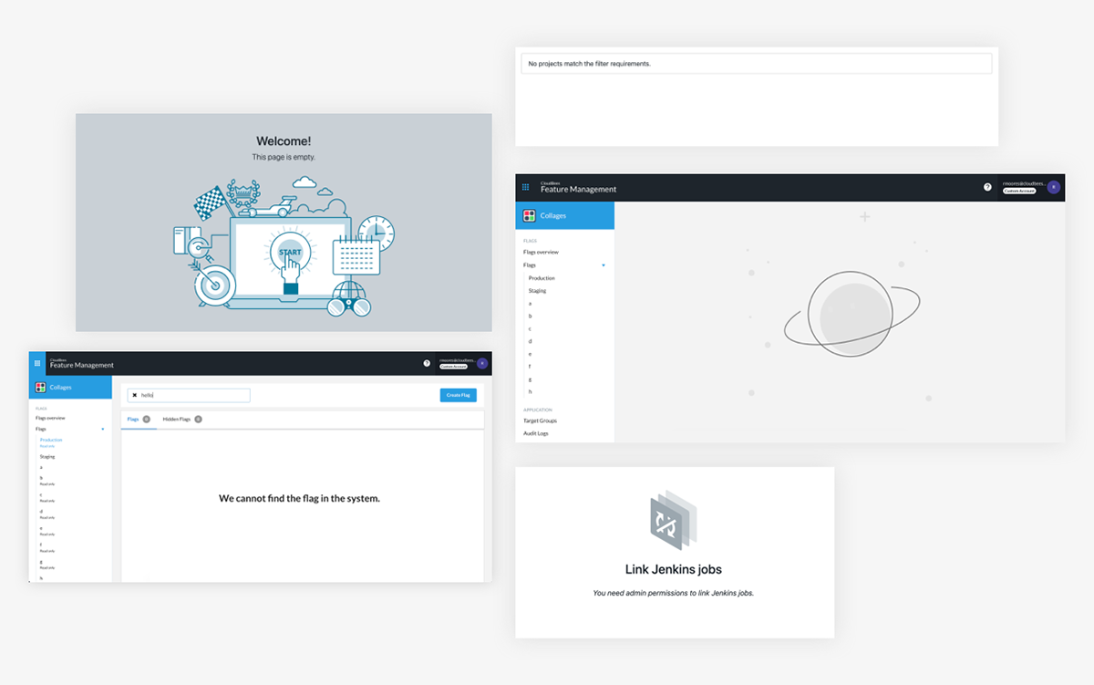
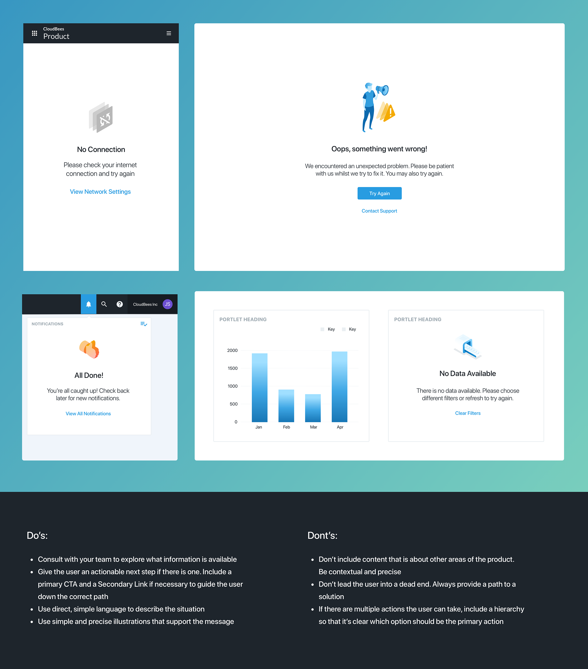
Existing Empty States
Below is an example of a few existing empty states that I found after auditing our products:
Insights
In what ways might we measure our user engagement? I came up with a few ideas to validate our hypothesis, and worked with PM to define some project goals.

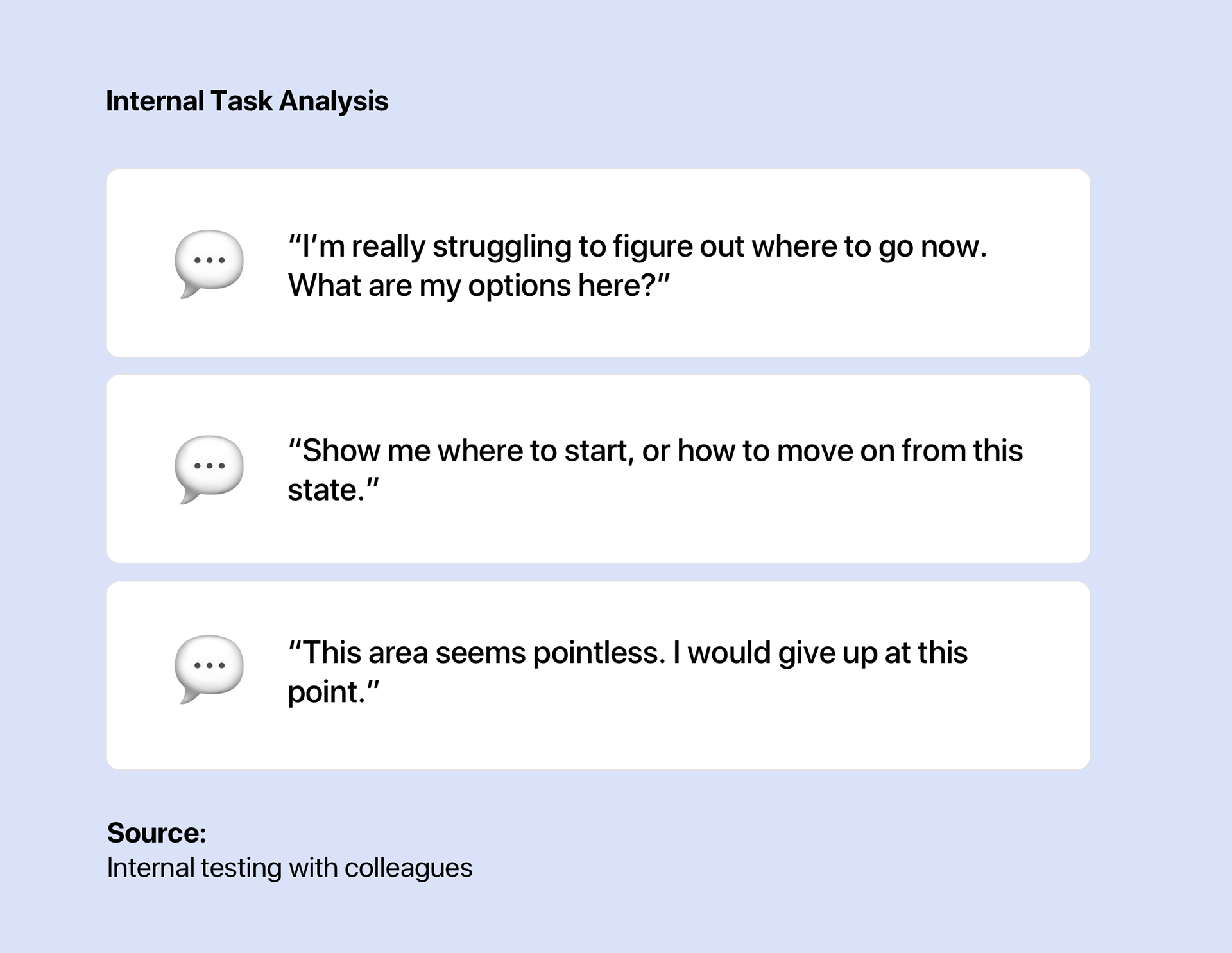
I decided to conduct a task analysis in order to gain clear insights that were specifically a result of our empty state. Quantitative data such as MAU's and retention were also interesting for me to acknowledge, however it would be harder for me to attribute a change in these metrics solely to our empty states.

The Problem
During my interviews, when asked to complete a task that included an empty state:
👉 7 out of 8 (87%) people experienced friction
👉 6 out of 8 people (75%) said they would exit the task
The Solution
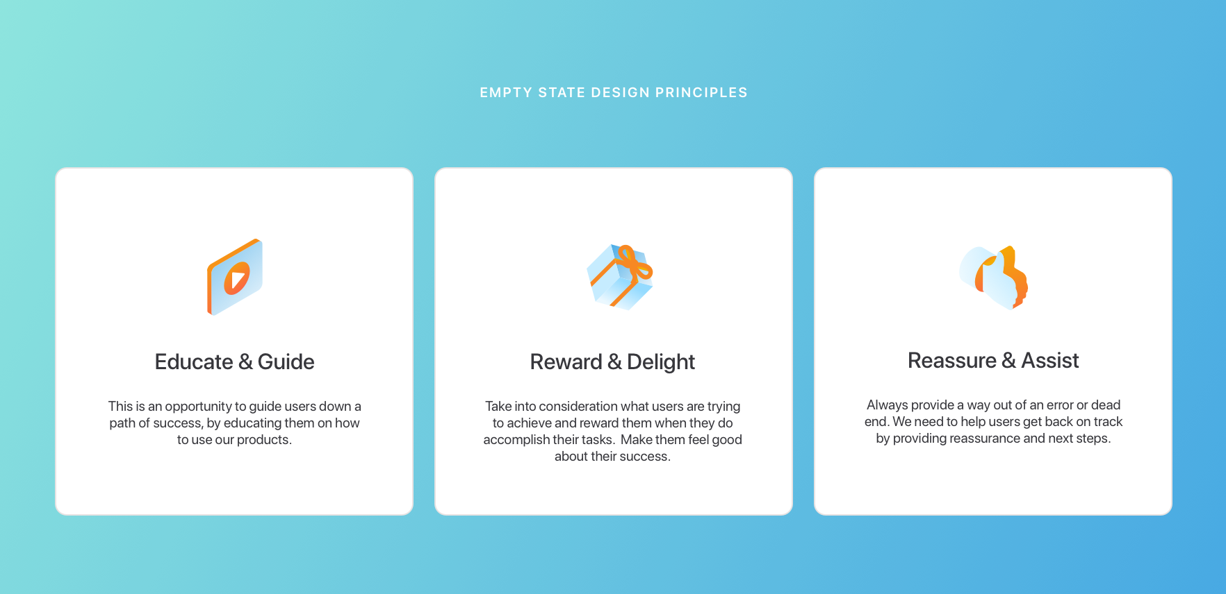
✔️Improve user engagement by reducing friction and exit rates by 50% in the first month, by designing an empty state pattern that provides contextual support for users, visual consistency and a clear path forward.
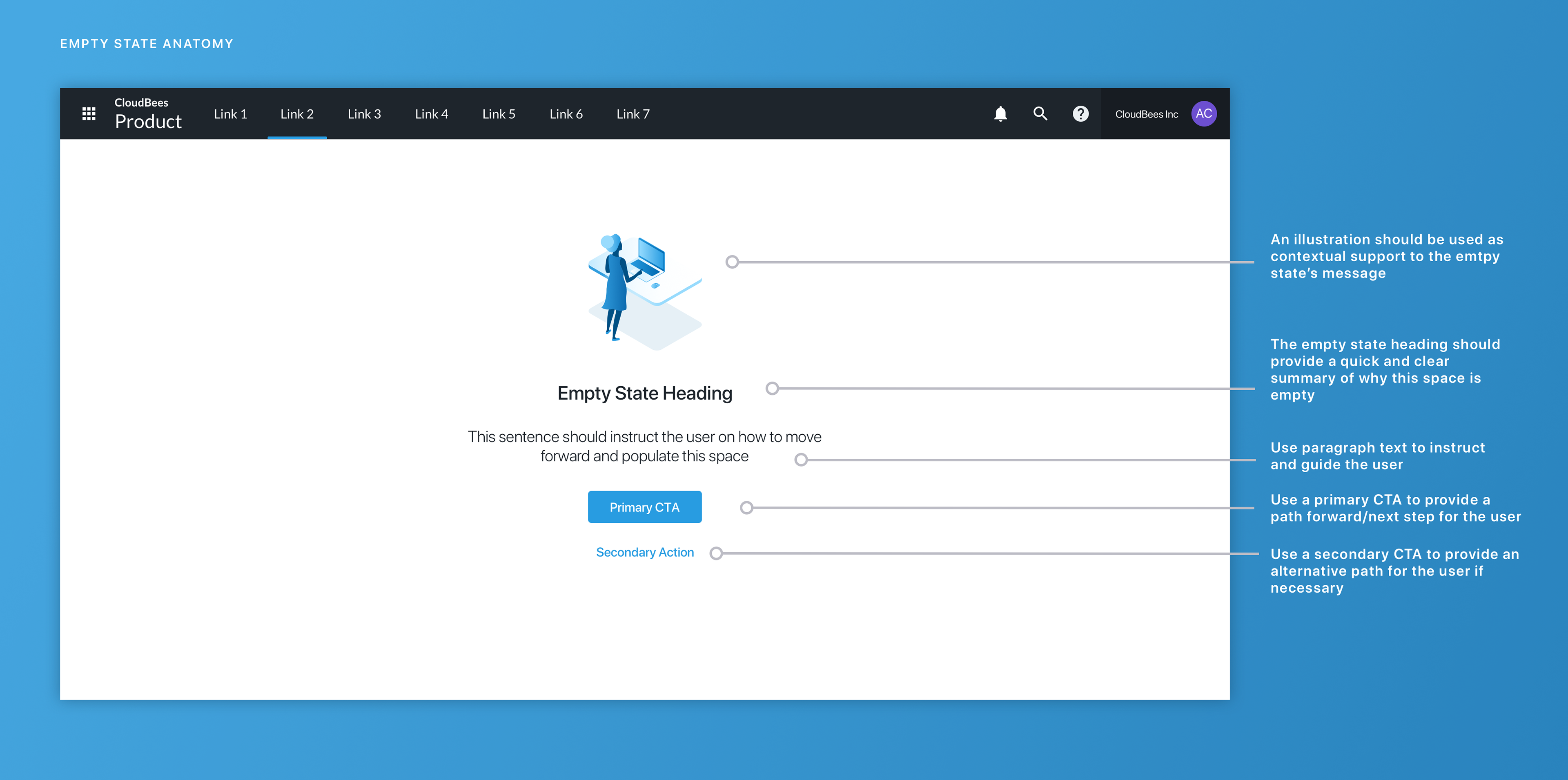
Designing a flexible pattern as part of a larger design system
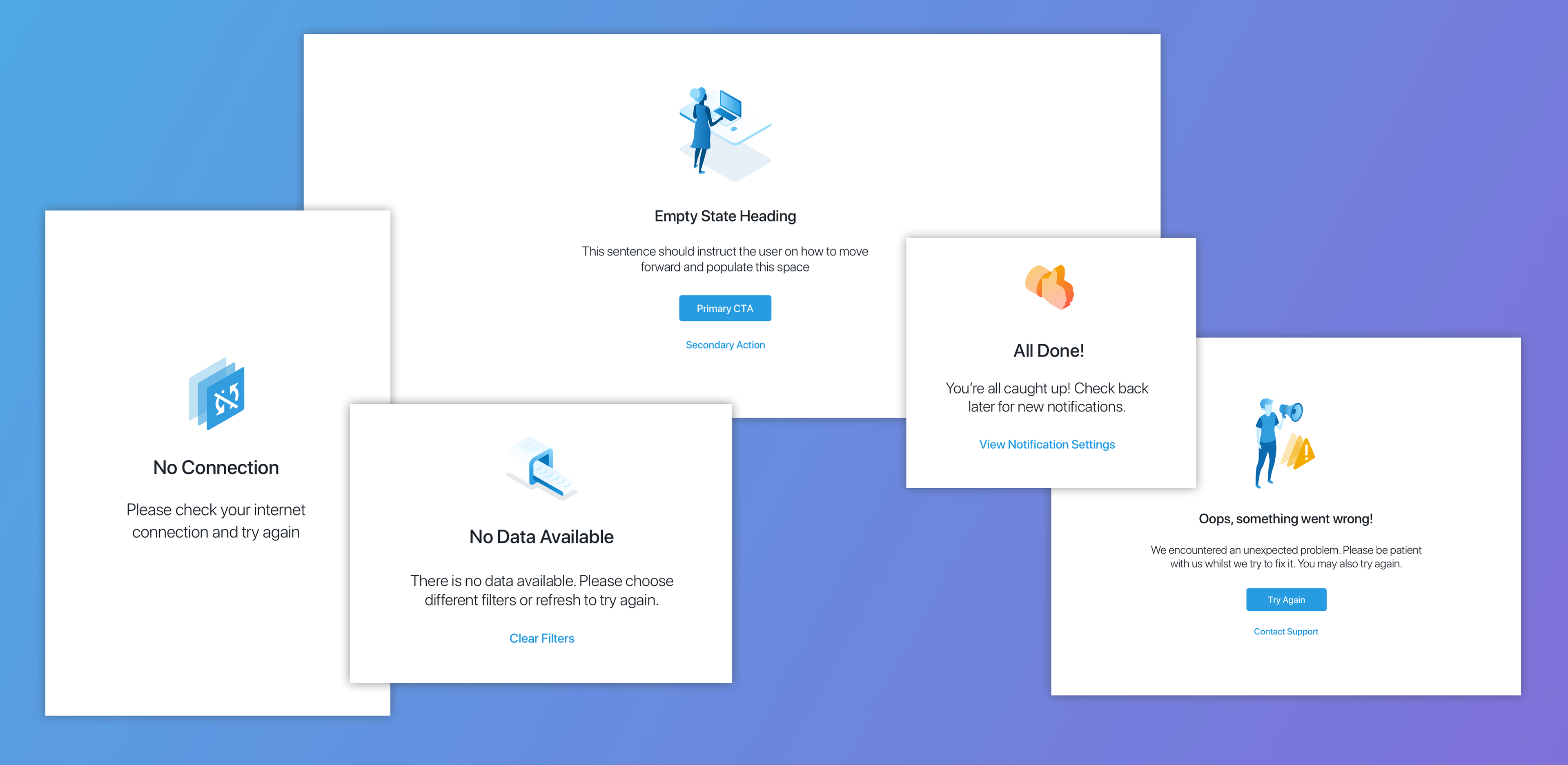
During my audit of the product, I noticed that there were 3 different types of empty states that my pattern needed to adapt to. I outlined them below and provided guidance for the team.

The Outcome
✅A predictable and frictionless user experience
✅Visual consistency inherited from our design system
✅Clear documentation that guides designers and engineers on how and when to use this pattern
Challenges
We have a large amount of products and instances where we need empty states, so trying to find one solution that fits all is a challenge. I found that the best solution to this was to keep the pattern as simple as possible, only using necessary components and giving the designer the power to break the symbol and adapt it to their needs.
Measuring Success
To measure the success of this project I'd like to conduct another task analysis and compare the results with those in the beginning.
I'd like to see positive reactions and a sense of delight when users encounter our empty states, so we know that even though the area is empty, the experience is enjoyable. (I will update this page with the results asap).
This is an iterative process and as I continue to test, I'm sure that l'll uncover more insights that will contribute to a better UX.
Thanks for reading! 🙂